Client: Jack 'n Jill (URC) x Calbee | Category: FMCG, Snacks, Potato Chips | Variants: Classic Salted, Flamin' Chilli, Smoky BBQ, Japanese Curry | Format: 60g & 170g Bags | Market: Malaysia | Agency: Laugh Contagious Communications, Kuala Lumpur
The entire reason this product exists is provenance: Calbee is Japan's favourite potato chip, and the co-brand with Jack 'n Jill brings that pedigree to Malaysia. So the pack's first job — before it even gets to making you hungry — is to make that Japanese authenticity feel real and earned, not borrowed. The design leads with the credential: Japanese script (ポテトチップス) sits prominently with the "Japan's Favourite Potato Chips" endorsement, so the provenance reads instantly and legitimately. The harder craft is the co-branding itself — two trusted names, Jack 'n Jill and Calbee, sharing a single locked-up logo that has to feel like one confident brand rather than a partnership bolted together, balancing the local familiarity of Jack 'n Jill with the imported credibility of Calbee. Get that lock-up right and the shopper reads trusted local distributor + authentic Japanese product in one glance.
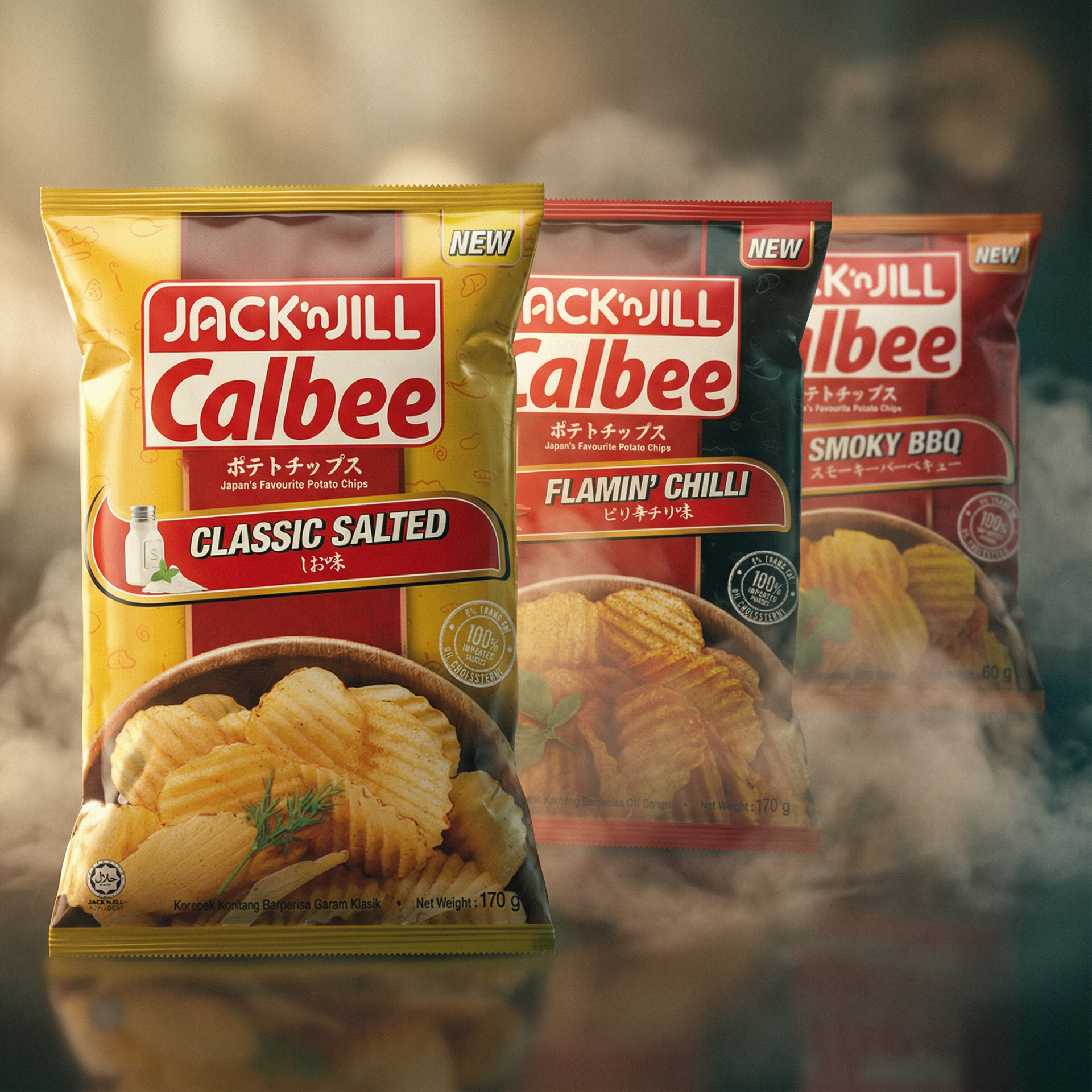
The range together — flavour-coded bags led by the Jack 'n Jill Calbee co-brand lock-up.
The rest is appetite, because no snack pack survives on provenance alone. Each flavour is hero'd with a rich, golden bowl of crinkle-cut chips shot to look irresistibly crunchy, the single most important persuasion device in snack design. Bold flavour-coded colour blocks split the range for instant navigation — yellow Classic Salted, red Flamin' Chilli, dark Smoky BBQ, gold Japanese Curry — while a prominent "NEW" flash drives trial on the launch flavours, and quiet trust marks reassure without crowding the appetite cue. Each flavour name carries its Japanese reading too, threading the provenance through every SKU. As a creative agency in Kuala Lumpur, we designed the range so the shelf reads Japanese, the bag makes you hungry, and the two brands feel like one.
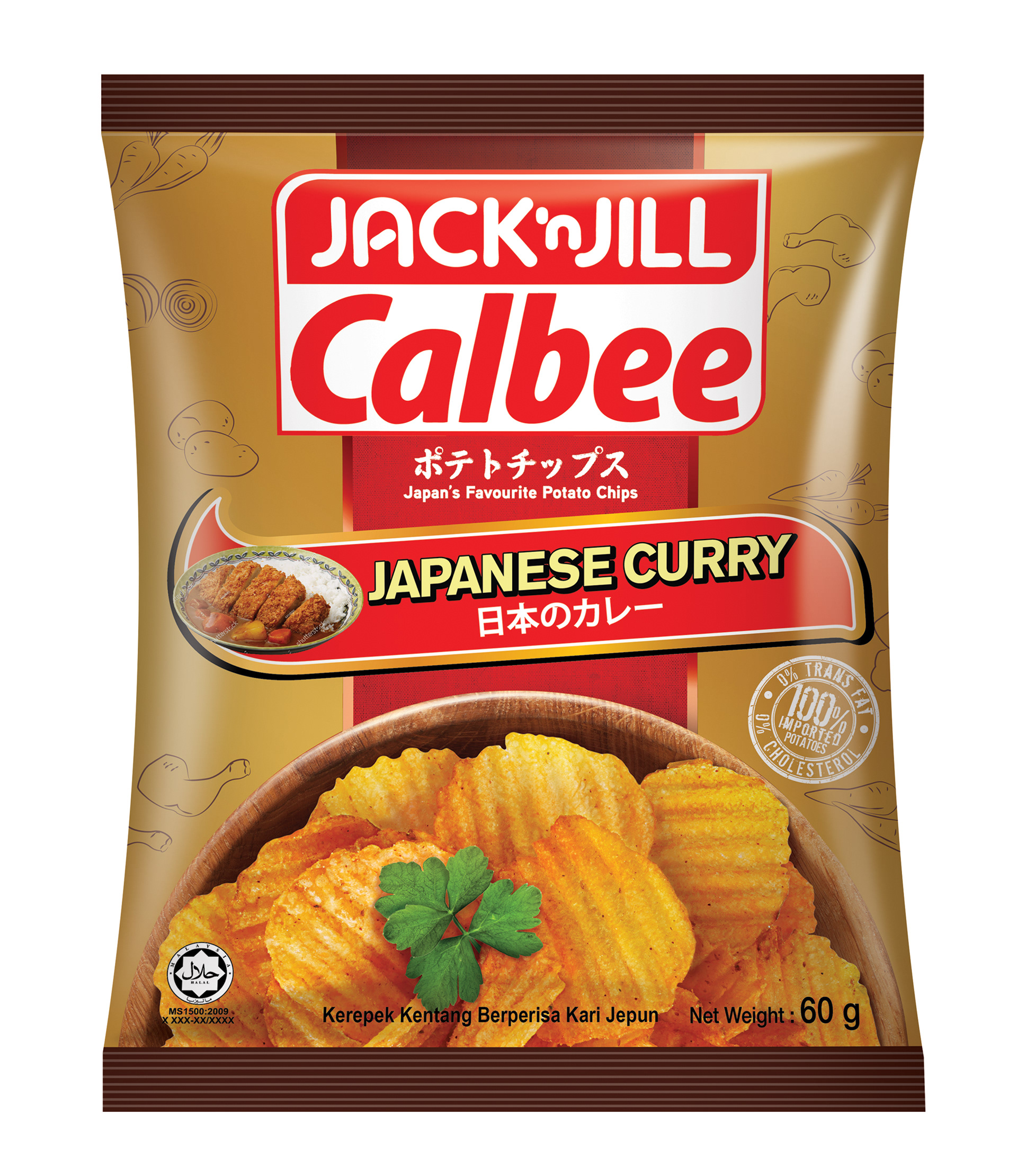
Japanese Curry — with a katsu-curry cue, Japanese reading, and a golden bowl of crinkle-cut chips doing the craving.
In snacks, appetite appeal is non-negotiable — if the food on the bag doesn't make a shopper hungry, nothing else matters. But the most interesting snack briefs add a second job on top: a provenance story (authentically Japanese, Korean, Thai), or a co-brand partnership where two names have to share one bag without diluting either. The discipline is layering those without smothering the craving — leading with mouth-watering product photography and bold flavour-coded navigation, then weaving in the authenticity cues and a co-branded lock-up that reads as one unified brand rather than a logo pile-up. The best of these packs make a shopper believe the story and reach for the bag in the same second. As a creative agency in Kuala Lumpur, we design snack and food packaging, co-brand and licensed-partnership lock-ups, and provenance-led range systems — appetite-first, always — for FMCG brands across Malaysia and Southeast Asia.
Capabilities applied to this project: Jack 'n Jill packaging, Calbee packaging, potato chips packaging design, snack packaging design, co-brand packaging design, partnership lockup design, Japanese provenance packaging, appetite appeal food photography, flavour-coded range design, multi-variant snack range, food packaging design Malaysia, FMCG packaging design Kuala Lumpur.
Got a snack with a provenance story or a co-brand partnership that has to sell the story and the craving?