Client: Minute Maid (The Coca-Cola Company) | Category: FMCG, Kids' Fruit Drink, Multi-Format Packaging | Variants: Orange (Oren), Orange & Mango (Oren & Mangga) | Formats: 250ml Bottle, 4-Bottle Shrinkwrap, 125ml Tetra | Market: Malaysia | Agency: Laugh Contagious Communications, Kuala Lumpur
Kids' beverages are sold through a split-screen decision. The child points at the one that looks the most fun — that's pester power, and it's won or lost on pure visual delight. But the parent holds the wallet, and they grant permission on something else entirely: is it nutritious, is it trustworthy, is it real fruit or just sugar? A kids' pack that only charms the child gets vetoed; one that only reassures the parent never gets pointed at. VITAKIDS had to do both at once, in the half-second the eye lands on shelf. So the design speaks two languages on one pack: irresistible fun for the kid, quiet reassurance for the grown-up — the playful "7 Vitamin & Mineral" badge, the real-fruit cue, the Halal and standards marks, all anchored by the black Minute Maid masterbrand panel that lends Coca-Cola's credibility to the whole thing.
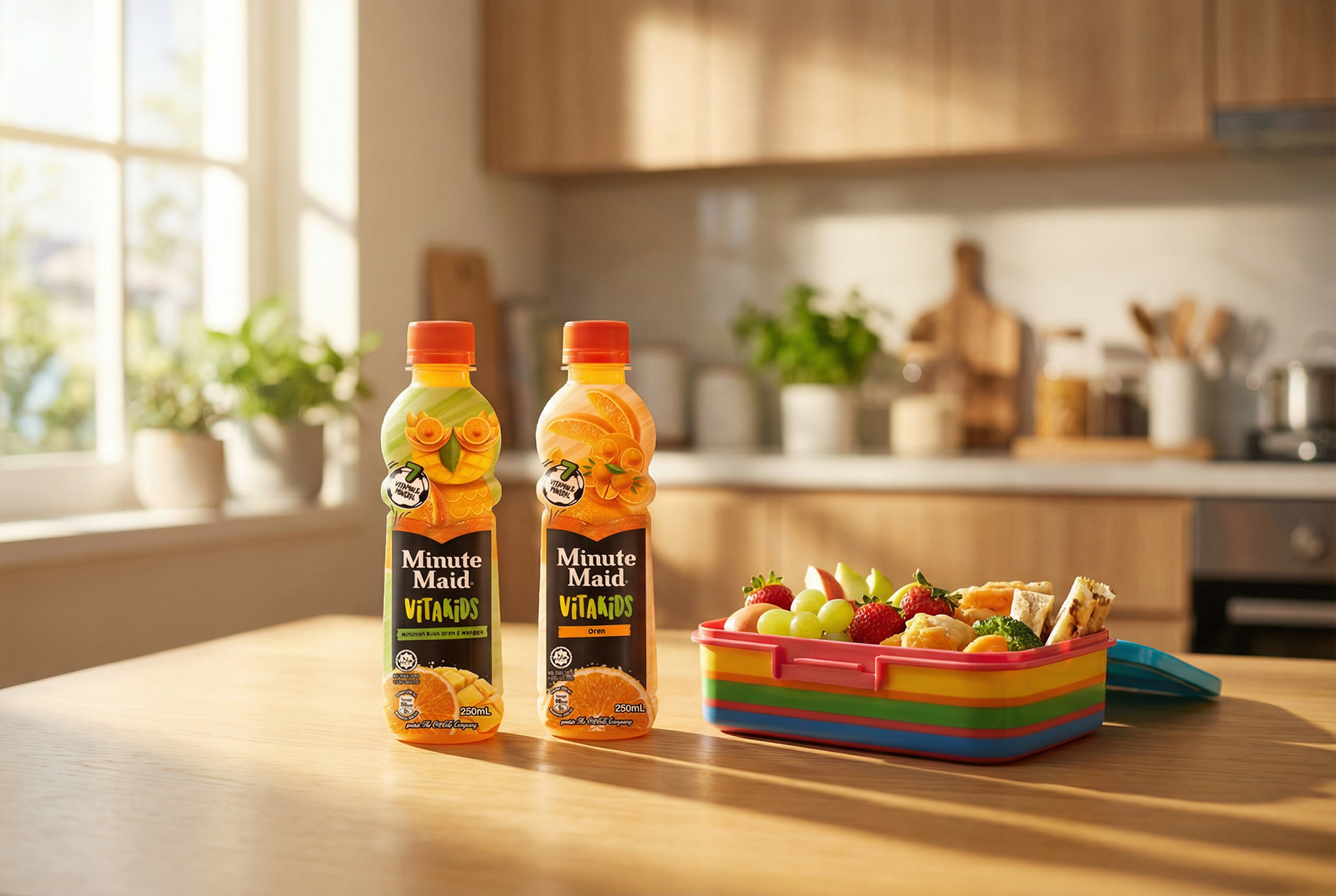
The range in its world — a lunchbox-ready kids' drink built to win both the child and the parent who packs it.
The fun is where the craft shows. Rather than a cartoon mascot, each pack heroes a character sculpted from real fruit — an owl built from orange slices and mango cubes — a single device that's playful, appetising, and a "made with real fruit" proof point all at once. The bottle's bulbous structure becomes part of the gag, its double-bulb neck cradling the fruit-creature so the pack itself feels like a toy. Then the whole system was built to stretch across three very different formats without losing the character: the grab-and-go 250ml bottle, the 4-bottle shrinkwrap multipack a parent buys for the week, and the 125ml Tetra pack that slips straight into a lunchbox. As a creative agency in Kuala Lumpur, we designed VITAKIDS to be pointed at and approved — because a kids' drink only sells when it wins both.
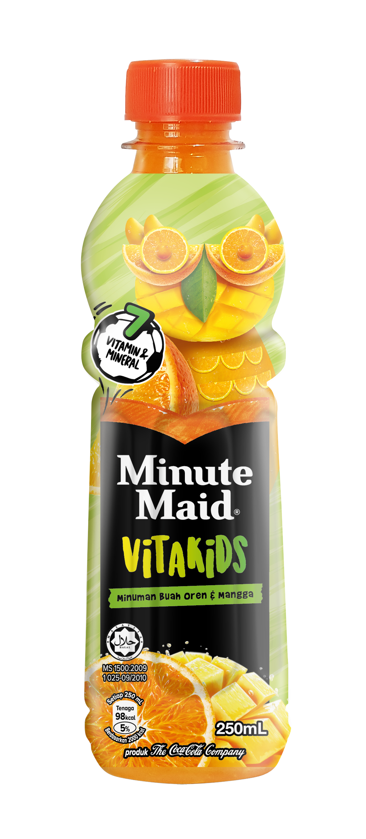
Orange & Mango — a fruit-owl sculpted from real orange and mango, the bottle's shape made part of the character.

Orange — the same playful fruit-character system in the core flavour, the bulbous bottle doing double duty as the creature.
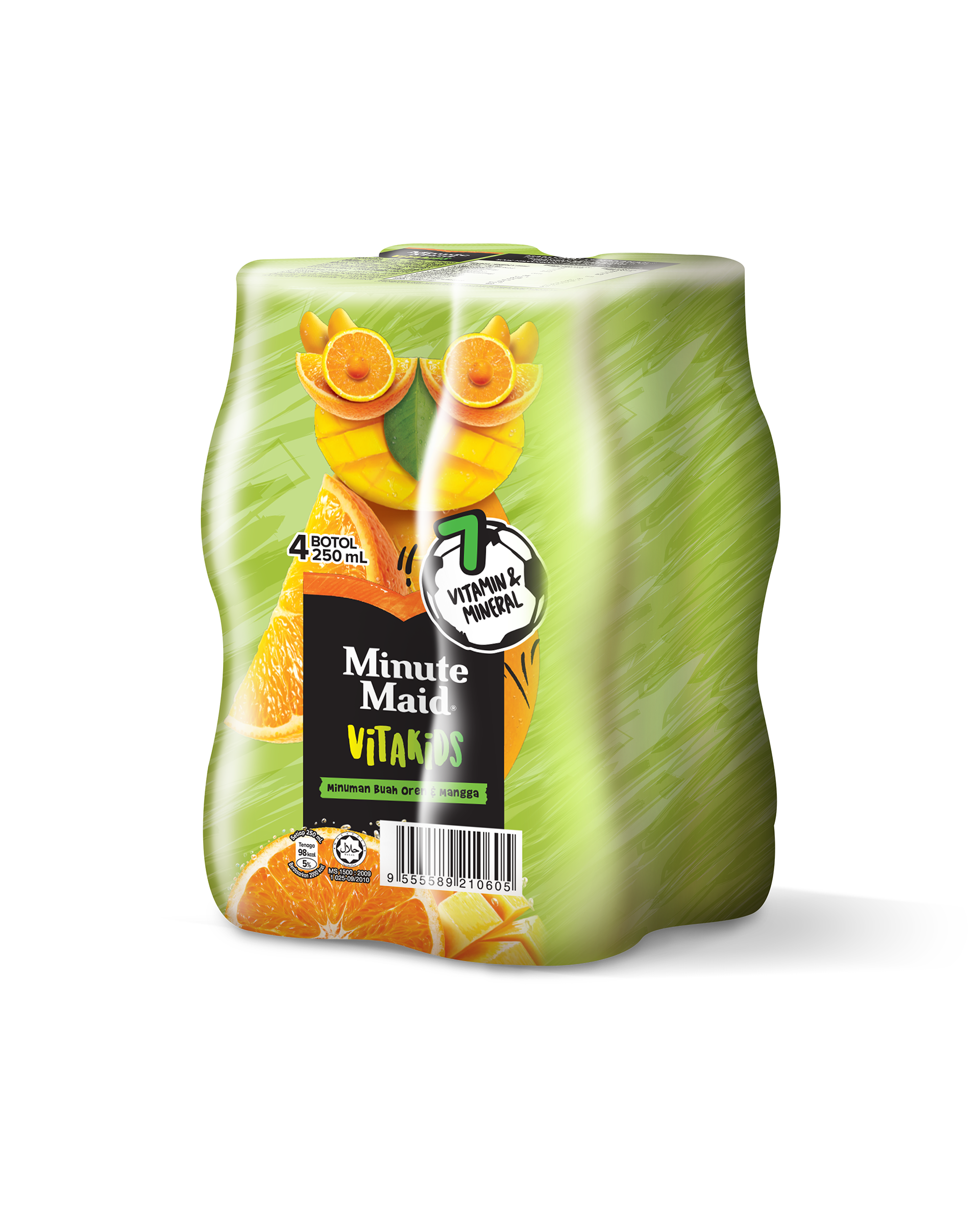
The 4-bottle multipack with the character carried cleanly across the shrinkwrap.
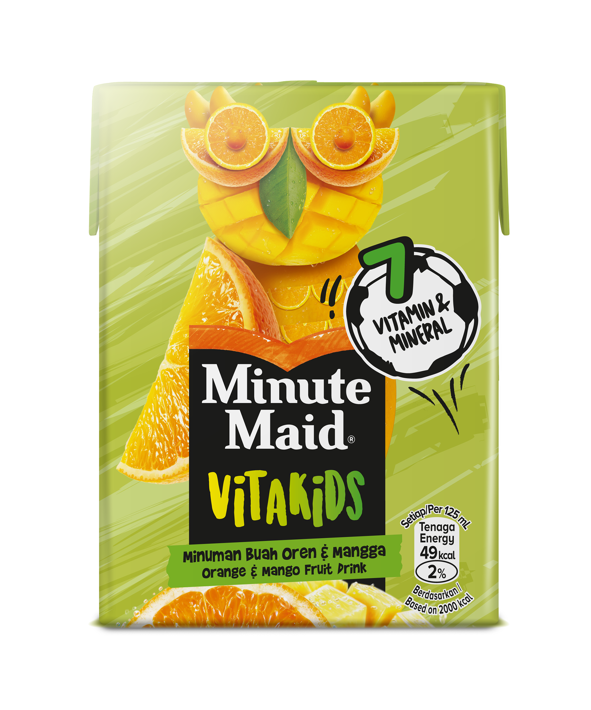
The 125ml Tetra pack — lunchbox-sized, the system holding on a completely different format and structure.
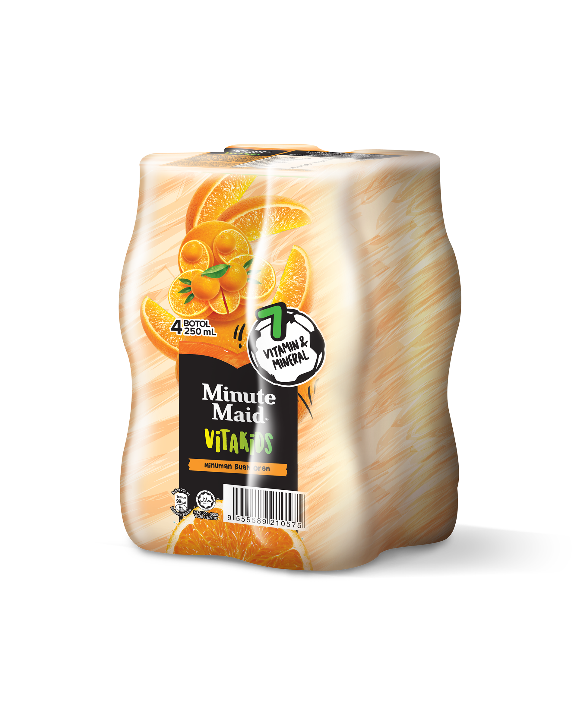
The orange multipack — one coherent range across both flavour and format.
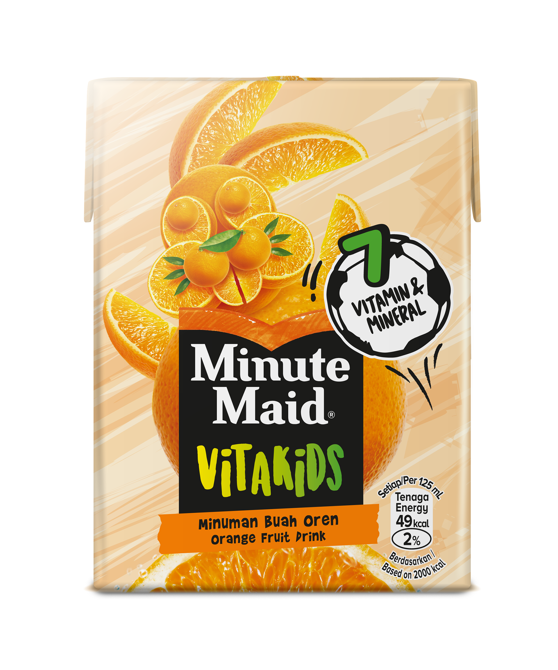
Orange in Tetra — the grab-and-go carton built for school bags and on the move.
Designing for children is really designing for two people with opposite priorities. Get the fun wrong and the child never reaches for it; get the reassurance wrong and the parent puts it back. The discipline is holding both in balance on a single pack — genuine play and visual delight that earn a child's attention, sitting alongside the nutrition cues, ingredient honesty, and brand trust that earn a parent's permission — and doing it responsibly, without overpromising. The craft is a system playful enough to win the child, credible enough to win the adult, and consistent enough to hold across every format and shelf it appears on. As a creative agency in Kuala Lumpur, we design kids' and family packaging, character and fruit-illustration systems, and multi-format range architecture across beverage, food, and dairy — for FMCG brands across Malaysia and Southeast Asia.
Capabilities applied to this project: Minute Maid VITAKIDS packaging, Minute Maid kids packaging, kids fruit drink packaging design, children's beverage packaging, fruit character packaging design, multi-format packaging system, PET bottle packaging design, shrinkwrap multipack design, Tetra pak design, Coca-Cola Malaysia packaging, real-fruit cue packaging, FMCG packaging design Kuala Lumpur.
Got a kids' or family range that needs to win the child and the parent — across every format it ships in?